css-secrets
Backgrounds & Borders
Translucent
半透明的边框,背景background-clip的属性默认值是border-box,要实现半透明边框效果,需要把这个属性改成padding-box;background-clip: padding-box;。
multiple borders
- 多边框效果,可以用边框阴影来模拟 ‘box-shadow: 0 0 0 10px #655, 0 0 0 15px deeppink;’ ,边框阴影是一个叠一个的,所以要调整spread radius 。这个方案大多数时候很好用,但也有一些缺点:
- 阴影毕竟不是边框,它们不占空间,所以需要用额外的padding or margin 去调整(取决于shadow是inset or not)
- 这些假边框也不能捕捉鼠标事件,所以也需要用上面的方式去调整。
- 用outline 模拟,之前用阴影模拟只能产生实线的效果,如果需要dashed 等border style 就可以用outline来模拟,outline-offset 这个属性是控制outline 和border间距的,可以为负值,实现一些有意思的效果。当然单用outline ,同样也有局限:
- 多边框效果,outline 只能有一个,所以只用outline 和 border 只能实现2个边框。
- 不被border-radius 影响,这个被css wg 认为是个bug,未来可能被修复。
- “Outlines may be non-rectangular” ,这个比较抽象,看了规范(w3.org/TR/css3-ui), 也不是很了解具体的形式。
自己的一些实验体会:可以结合这两种方法用;outline的z-index比较大啊,还有同样不能捕捉鼠标事件。
Flexible background positioning
扩展的背景位置,在CSS Backgrounds & Borders Level 3 中表明,可以在offset前加位置关键词来定位
background: url(code-pirate.svg) no-repeat #58a;
background-position: right 20px bottom 10px;
这个属性在查了下,ie8 不支持,可以为它提供一个fallback:
background: url(code-pirate.svg) no-repeat bottom right #58a;
background-position: right 20px bottom 10px;
background-origin 这个属性默认是padding-box,可以改为content-box来改变背景图的位置。
用calc(), 可以混合百分比和px,运算符前后要加空格:
background: url("code-pirate.svg") no-repeat;
background-position: calc(100% - 20px) calc(100% - 10px);
Striped backgrounds
条纹背景,用线性渐变来模拟条纹效果:
横条纹
background: linear-gradient(#fb3 30%, #58a 0);
background-size: 100% 30px;
竖条纹
background: linear-gradient(to right, /* or 90deg */ #fb3 50%, #58a 0);
background-size: 30px 100%;
斜条纹,有所不同,需要创建一个这样的重复区域
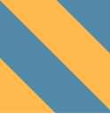
background: linear-gradient(45deg,#fb3 25%, #58a 0, #58a 50%,#fb3 0, #fb3 75%, #58a 0);
background-size: 42px 42px;
这个方法不是很灵活,所以需要用别的属性实现
repeating-linear-gradient()和repeating-radial-gradient()
斜条纹中的第一种写法可以优化为:background: repeating-linear-gradient(45deg,#fb3, #fb3 15px, #58a 0, #58a 30px);
Complex background patterns
复杂的背景样式,作者创建了很多css3 patterns,还有用svg 创建的,这些样式有些只是为了展示,可能并不实用,作者也推荐大家用一些预处理语言来写这些样式,如下面说到的 polka dot 样式,就创建了一个sass的mixin。
书中介绍了几种常用的背景样式:
Grids
格子背景Polka dot
波尔卡圆点Checkerboards
棋盘背景,这个比较复杂,需要组合两组三角背景拼接而成,也可以使用svg绘制,这个比较简单。
(Pseudo)random backgrounds
随机的背景,通过叠加多个背景图片,借助素数,来创建。有人总结为蝉的法则 the cicada principle ^1
background: hsl(20, 40%, 90%);
background-image:
    linear-gradient(90deg, #fb3 11px, transparent 0),
    linear-gradient(90deg, #ab4 23px, transparent 0),
    linear-gradient(90deg, #655 41px, transparent 0);
background-size: 41px 100%, 61px 100%, 83px 100%;
Continuous image borders
作者讲了border-image 属性的局限性,提供了一种用渐变背景模拟图片边框的方式,这里摘录几个例子:
复古信封边框,效果参考
div { padding: 1em; border: 1em solid transparent; background: linear-gradient(white, white) padding-box, repeating-linear-gradient(-45deg, red 0, red 12.5%, transparent 0, transparent 25%, #58a 0, #58a 37.5%, transparent 0, transparent 50%) 0 / 6em 6em; max-width: 20em; font: 100%/1.6 Baskerville, Palatino, serif; }行进的蚂蚁线,效果参考
div {
    padding: 1em;
    border: 1px solid transparent;
    background: linear-gradient(white, white) padding-box,
        repeating-linear-gradient(-45deg, black 0, black 25%, transparent 0, transparent 50%) 0 / .6em .6em;
    animation: ants 12s linear infinite;

    max-width: 20em;
    font: 100%/1.6 Baskerville, Palatino, serif;
}